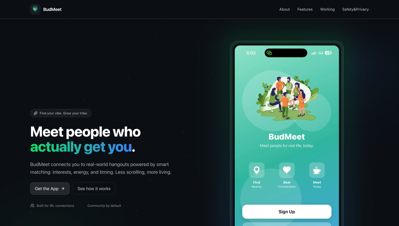
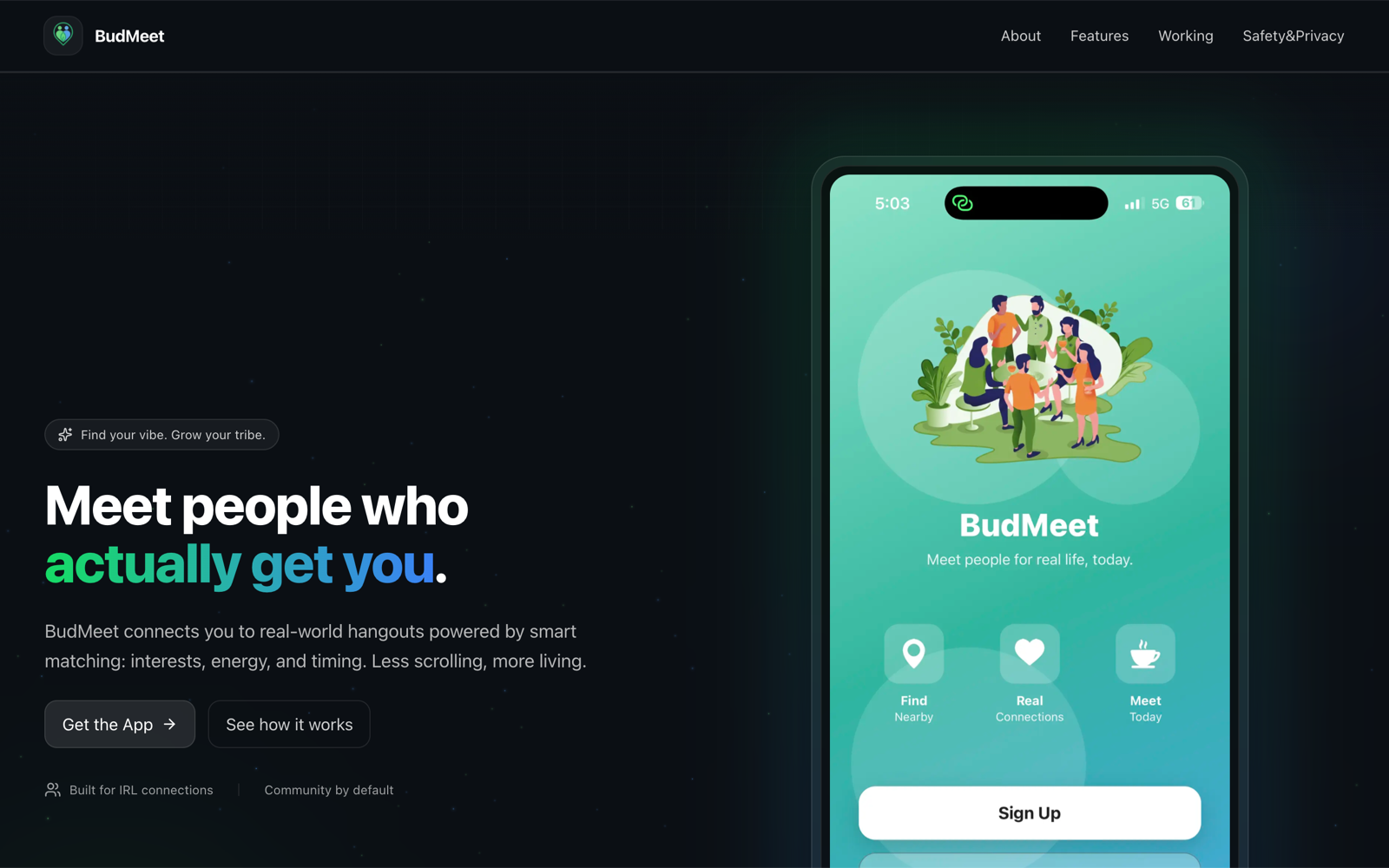
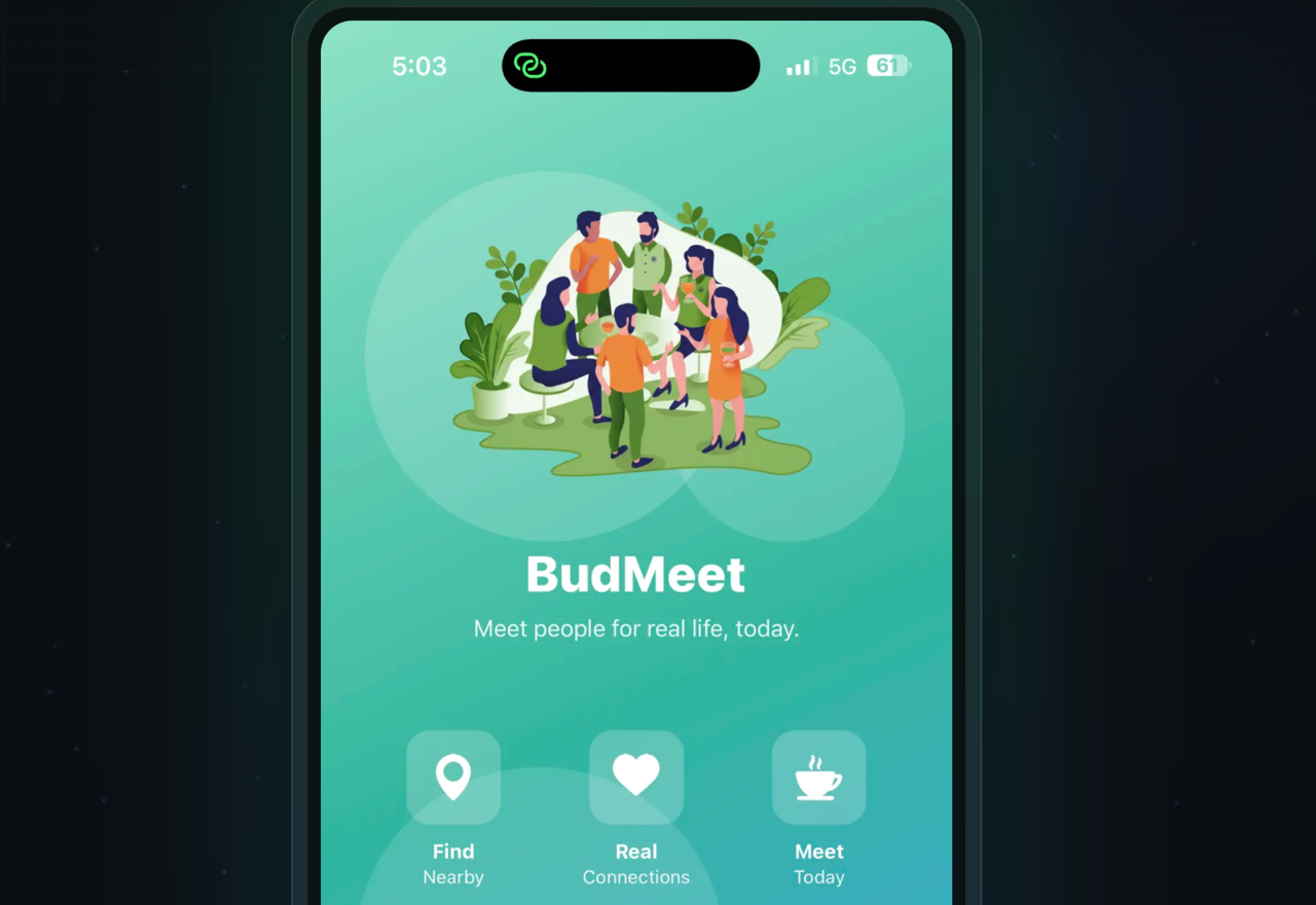
Case Study

BudMeet

BudMeet was shaped to make social discovery and communication feel easier to understand on mobile without collapsing into visual clutter.

Mobile-first social productLive product
BudMeet case study visual
Mobile-first productInteraction-heavy UXConsumer product

Challenge

Social products get crowded quickly when discovery, messaging, profiles, and engagement loops compete for attention. The product needed stronger hierarchy and a cleaner path for users on smaller screens.

Solution

The product combines social discovery, connection, and communication features inside a mobile-first system designed around cleaner interaction hierarchy and future feature growth.

Outcome

Public outcome metrics are intentionally withheld until verified and approved for release.

BudMeet gallery view
BudMeet feature crop
BudMeet interface crop

Features

Mobile-first discovery flowsMessaging and interaction patternsSocial profile statesRealtime-ready product structure

Tech

Mobile product engineeringRealtime-ready workflowsBackend integrationsProduct design systems

Scope

Product conceptingUX designFull product buildFeature expansion

Product goals

Make discovery and connection flows easier to navigate
Support interaction features without visual overload
Create a stronger product foundation for future mobile expansion

Delivery highlights

Reduced clutter so multiple interaction-heavy features can coexist more cleanly
Made social product states easier to interpret through clearer hierarchy
Built mobile-oriented user journeys around discovery, messaging, and engagement
Supported interaction-heavy product behavior with room for future feature growth
Next Step

Need a similar build, redesign, or product refresh?

Use the visuals and scope to judge fit, then start the conversation if the approach feels right.